Publication: The Romance Culture MagazineIssue: Spring 2004Trim: 8 × 11 inSelection: Cover, pages 6–7, 20–21
Categories
ROM: The Romance Culture Magazine
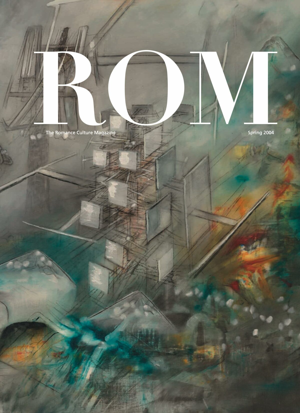

Publication: The Romance Culture MagazineIssue: Spring 2004Trim: 8 × 11 inSelection: Cover, pages 6–7, 20–21
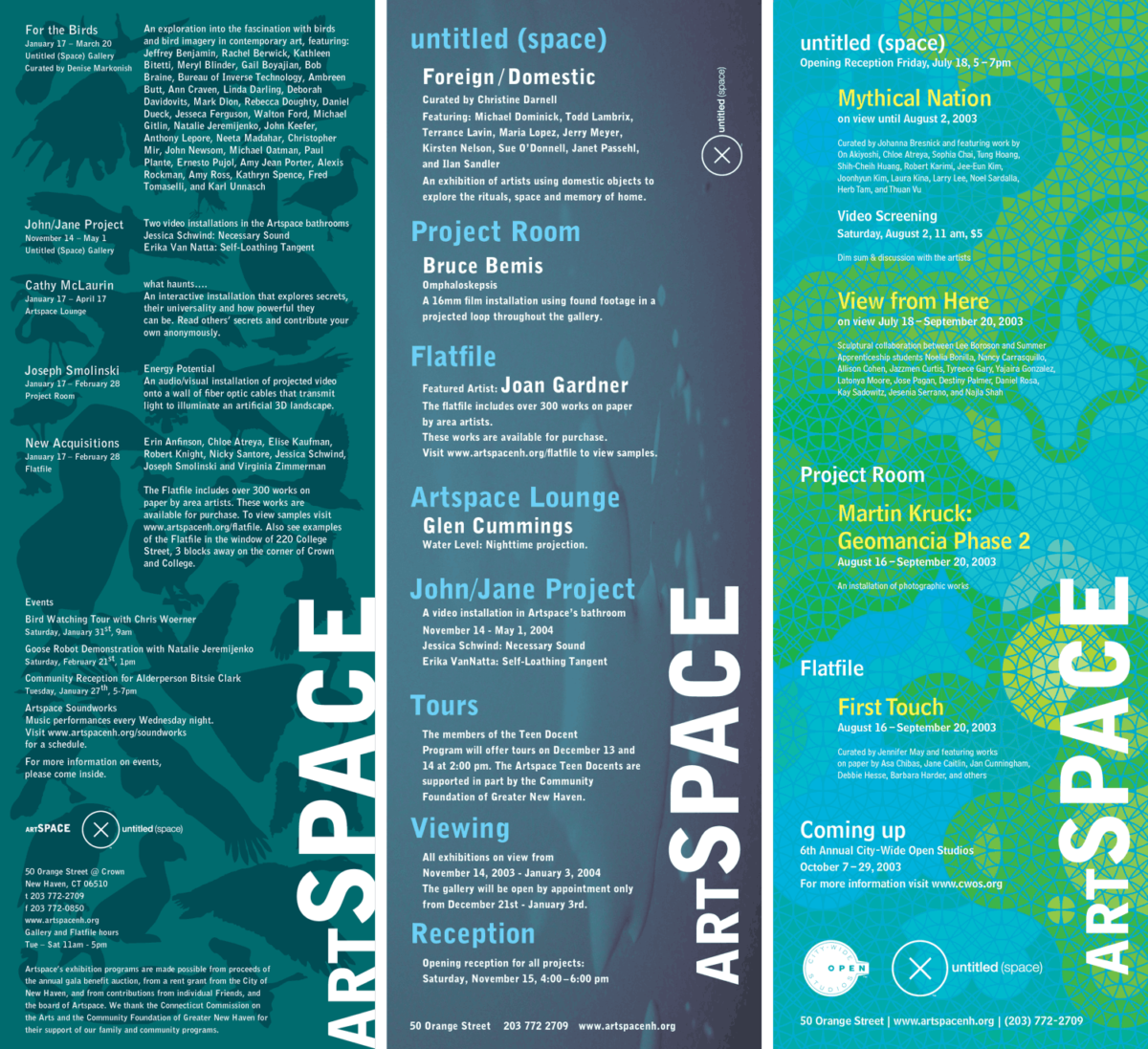
Environmental graphics for three exhibitions.
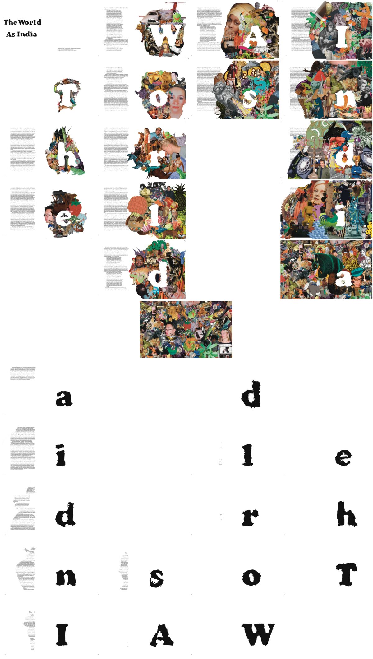
A map the size of the territory.
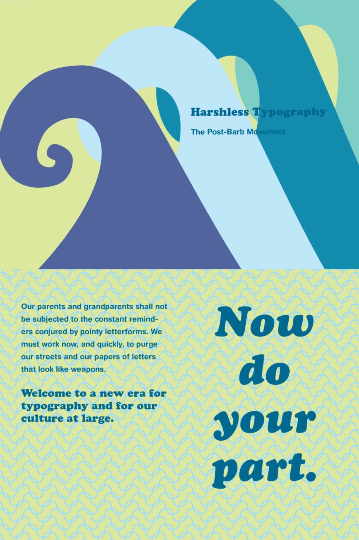
No more words-that-look-like-weapons as weapons.
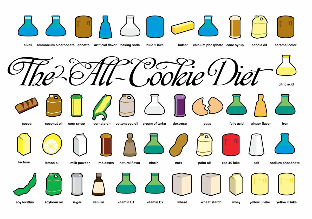
Nutrition when ‘sandwich’ is in the name
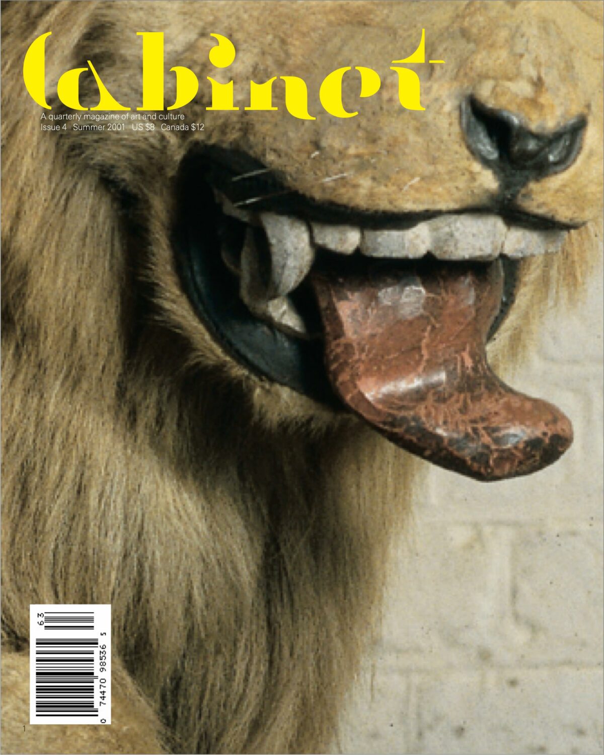
Cabinet Magazine, Fall 2001 (#4): designed in collaboration with Richard Massey, Hilites for Children, and Jessica Green.
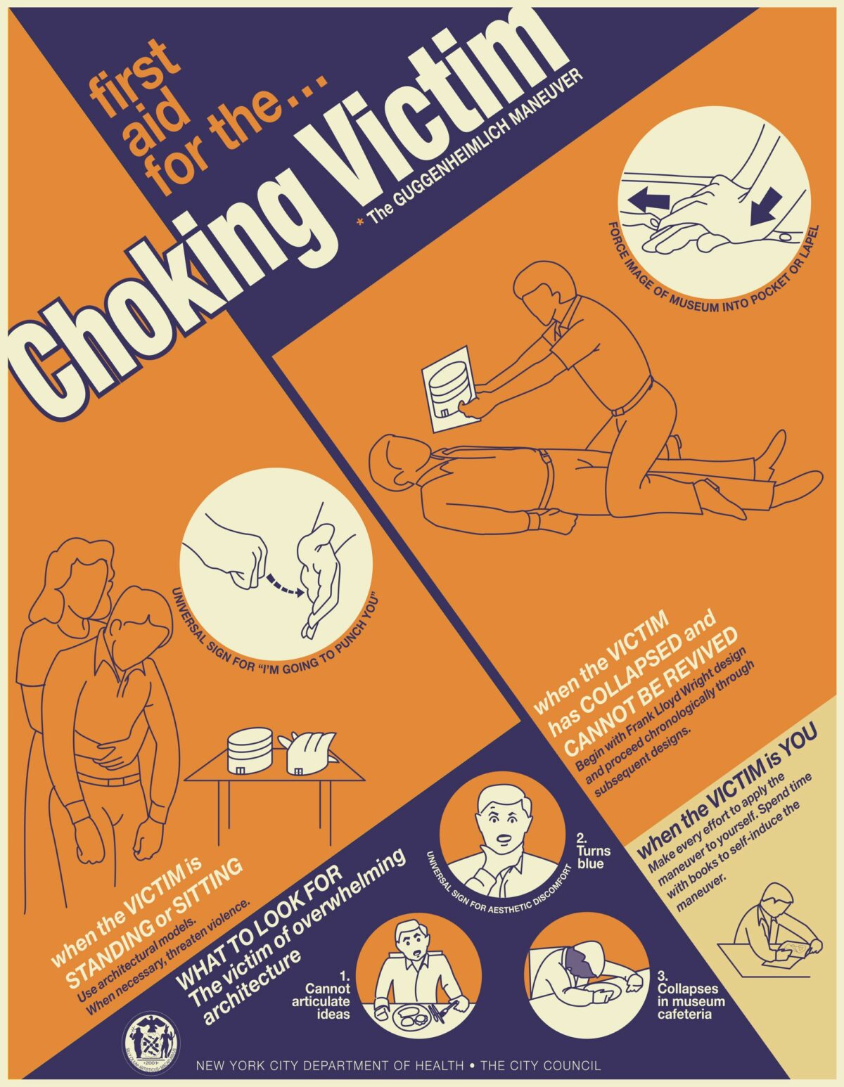
What to look for in victims of overwhelming architecture
